UX DESIGN / DESIGN LEADERSHIP
Online Giving
Project
CLIENT
The University of Texas at Austin
ROLE
Head of Design
Design Strategy
Experience Design
Design Systems
Product Design
SUMMARY
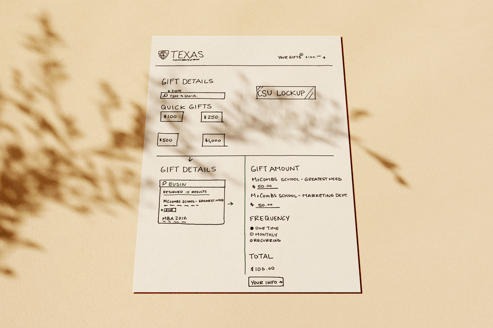
In 2018, I was responsible for leading the design, strategy, research, and development of a business plan for a new online donation platform—a one-woman team with excellent partners.
Background
Our marketing and communications team made it our fiscal year goal to update and modernize the online giving page (OGP).
The project was started and abandoned a few times over eight years. After I redesigned and enhanced the marketing experience on our Giving website two years prior, I knew I could also tackle this project.
The Problem
The page is difficult to use for the average donor, with an abandonment rate of over 90%. The process is lengthy and sometimes untrustworthy, with an outdated credit card processing system. The page is completely unusable on mobile.
We could only re-theme the site in 2018, but our engineering team was working on a new API that would allow us to create a new platform for giving.
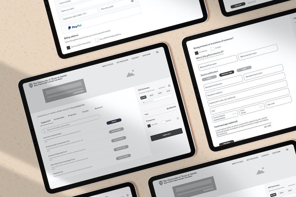
I would also need to fill in the gaps of a minimal design system that didn't contain the components I would need to prototype the platform.
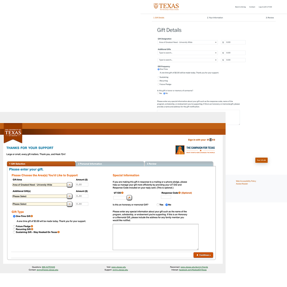
Online Giving Page
Front: 2012 Design
Back: 2018 Refresh
Research & Workshops
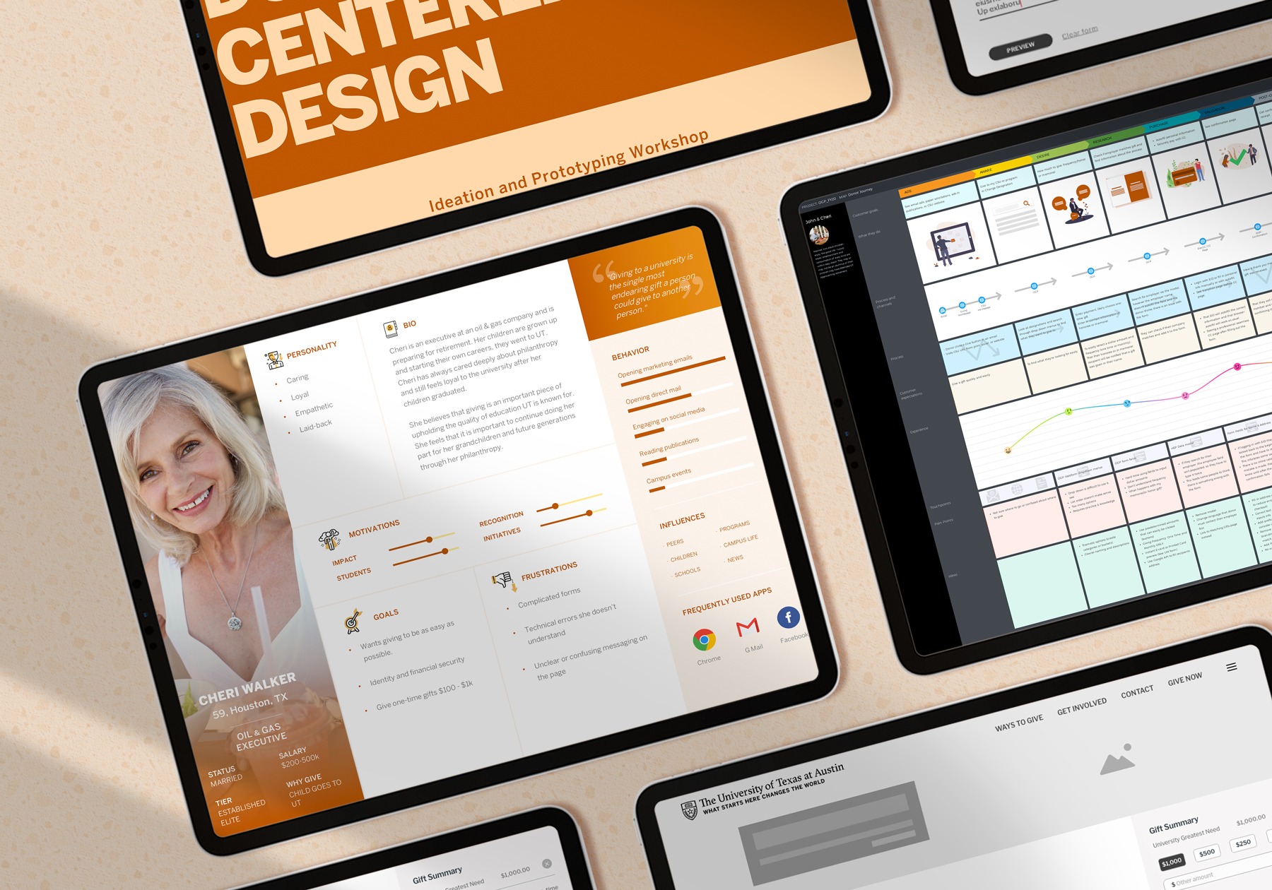
Before the design ideation workshop, my stakeholders needed to understand how to be donor-centric. I interviewed ten donors for feedback, created personas, held a donor journey workshop, and shaped a story about online donors we had never seen before.
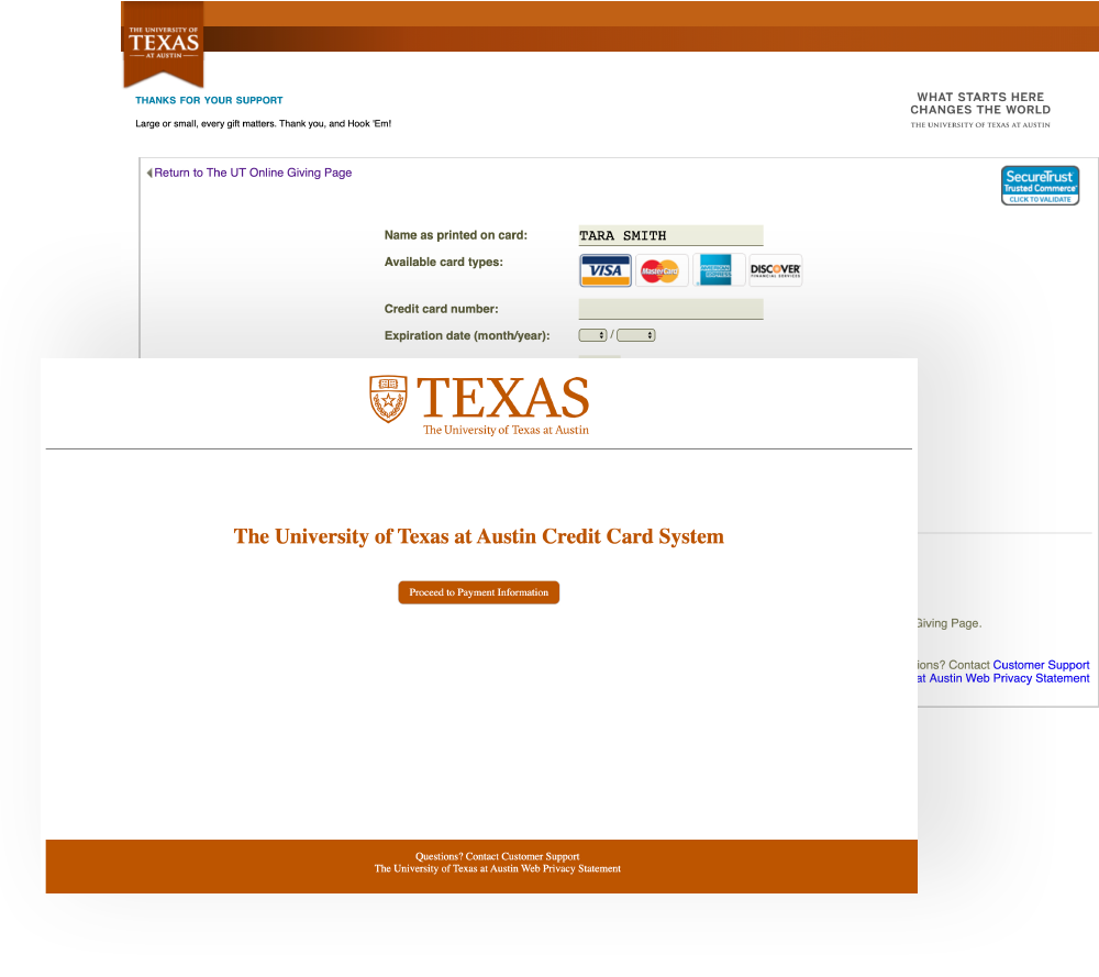
Donors have to click through a pre-screen before getting to an old credit card page.
Experience Challenges
There were so many challenges to this project, but a couple that stood out:
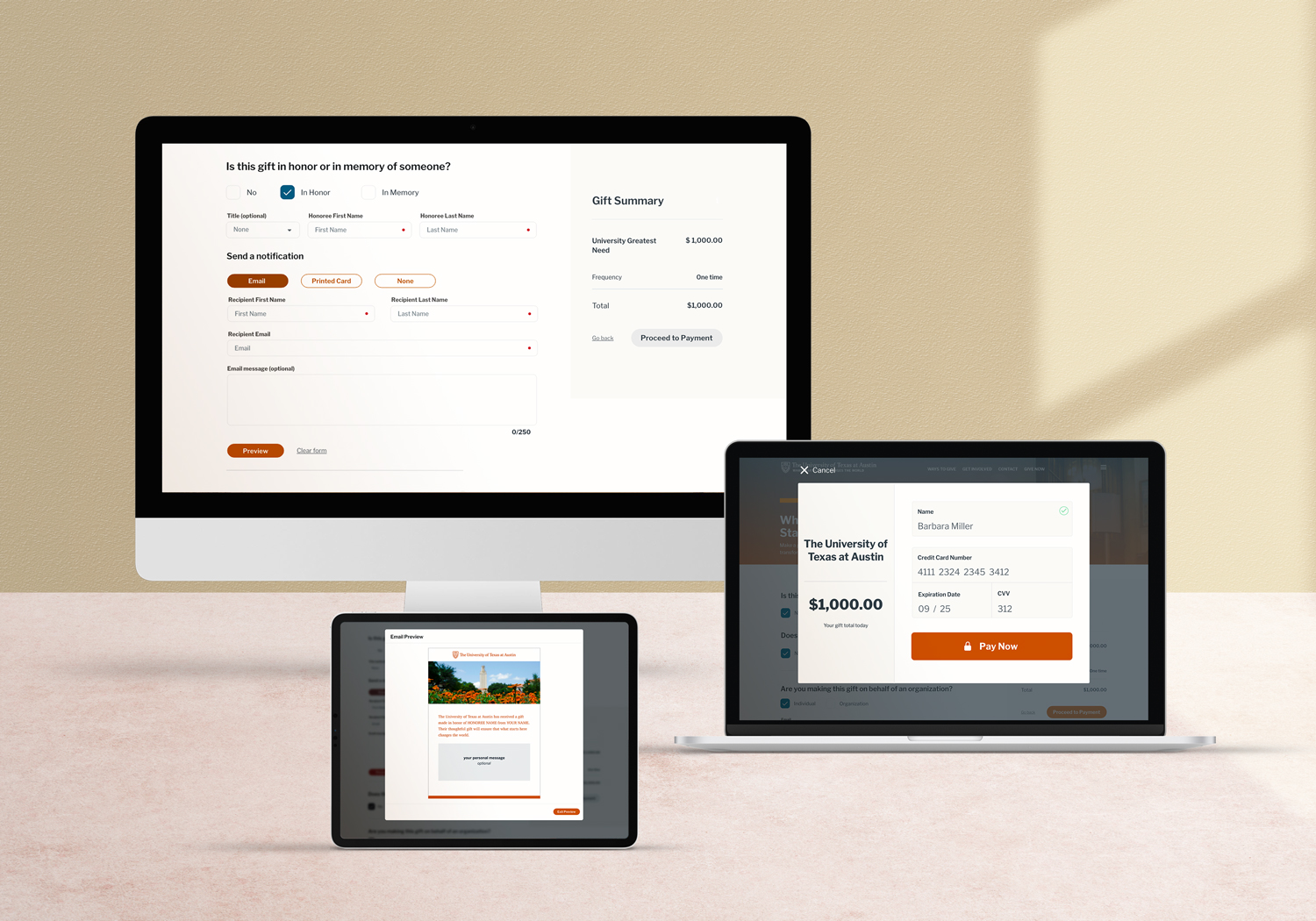
From our interviews, I found a significant lapse in communication regarding giving in honor or memory of someone. Donors and recipients often were not notified promptly, if at all. I thought this missed opportunity could easily be solved with good design and an automated system.
Another point of friction is our credit card processor. It was outdated and caused hours of manual work to keep credit cards updated.
Learnings
Usability testing confirmed the team's excitement over the ability to send emails and printed cards from OGP. Testing participants thought the idea was thoughtful and inspired them to give.
I fought for embedded payment fields in our form; however, to be PCI compliant, it looked like it wouldn't happen. I ran a test with donors with the new payment processor in a modal and one embedded in a form.
I was wrong.
To my surprise, four out of the five donors preferred the modal.
So I let it go. Donors got the modal.
Online Giving Today
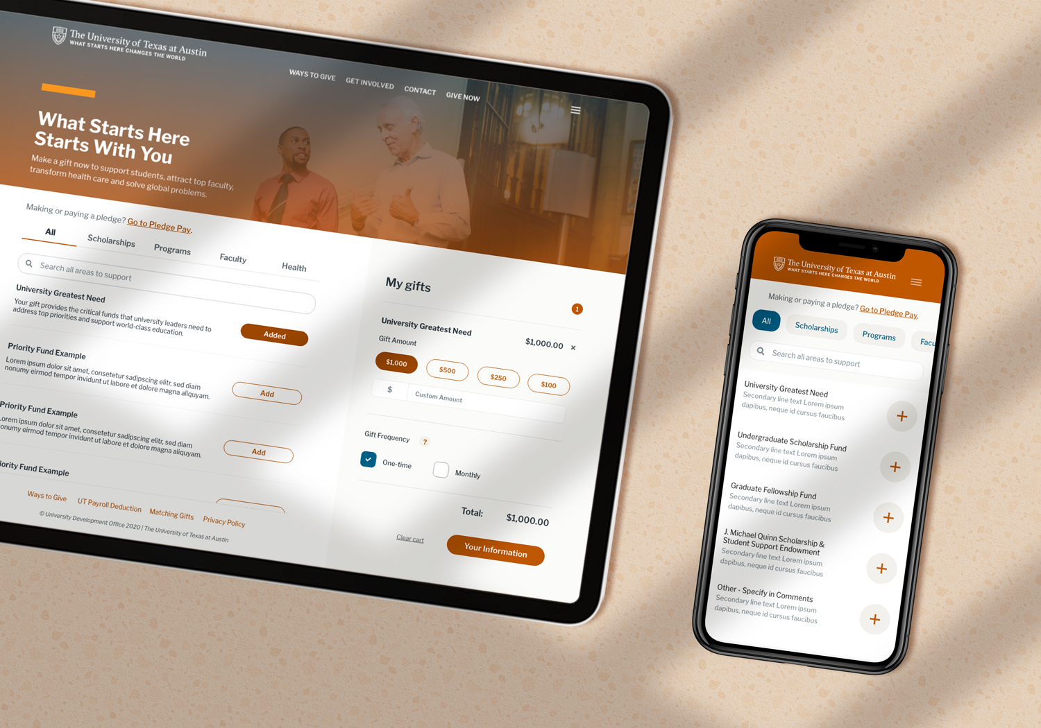
Donations soared after launch, tripling and aiding the University's $5B campaign. Because I spent so much time with donors and observing them, I created an experience that felt special.
2024 Update:
This work is live and hasn't changed much since it was launched. You can view the fundraising website at giving.utexas.edu and the fundraising platform at give.utexas.edu
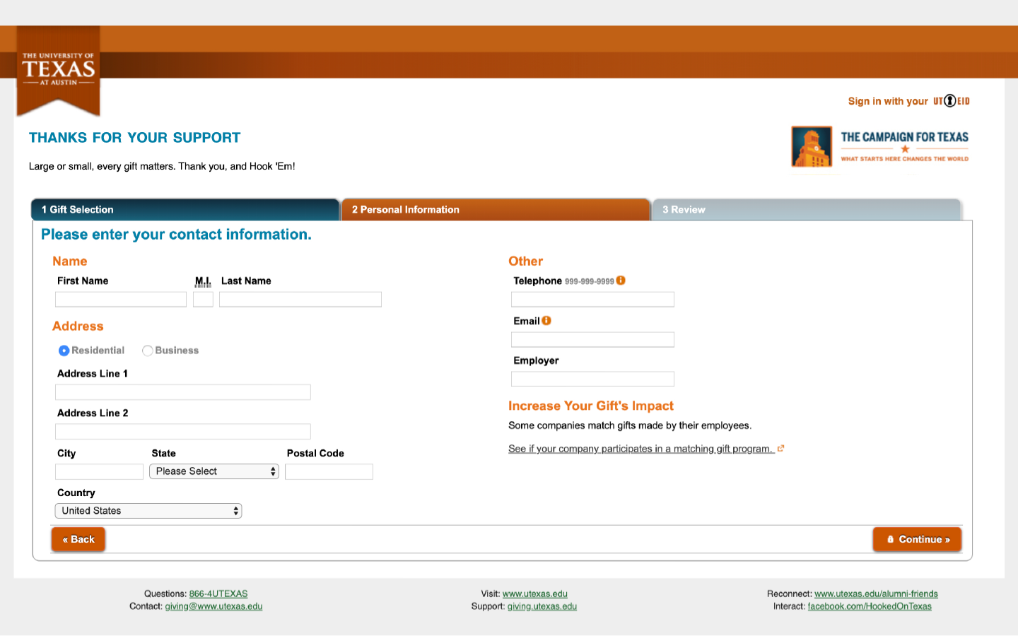
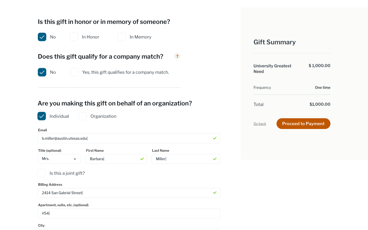
Other new features include a sticky cart through the whole process, inline validation, Google Place Autocomplete API injected into all address fields, and inclusive language surrounding titles and joint gifts.
© 2024 Tara Smith
Illustrations by Annie Konst
